EPUB text cut off? The book asked for a wider screen

The reports have piled up on MobileRead for a decade and keep coming: text running off the right-hand side on a Kobo, the ends of lines missing in a desktop reader, an EPUB that loses a strip of every page after conversion. Adobe’s InDesign community has its own version, with captions and sidebars clipped in exported books. The words are different; the geometry underneath is the same.
What makes this fault maddening is that the missing words are nowhere. They are not on the next page. They are not revealed by scrolling, because paginated readers do not scroll sideways. The book has been laid out wider than the glass, and the strip past the edge is simply never drawn.
Laid out to a number, shown on a screen
An EPUB is reflowable by default. Nothing in the format fixes a line length, so a paragraph asked to render on a 360-pixel screen wraps at 360 pixels, and the same paragraph on a tablet wraps wider. Every line ends where the display does. That is the whole contract.
A stylesheet can break the contract with one declaration. body { width: 600px } tells the layout engine to build a 600-pixel page regardless of what the book is displayed on, and the engine obeys — layout comes first, display second. The screen then shows the part of that layout that physically fits. On anything narrower than 600 pixels the remainder is cropped, and because the crop happens after pagination, no amount of page-turning reaches it: the missing words sit to the right of every page, not on a later one.
Exports from page-layout habits are where these declarations come from. A designer working on a wide monitor sets a comfortable text-column width in pixels, the export writes it into the EPUB’s CSS, and the book works on every screen at least that wide — which is to say, on every screen the designer tested.
Three faults, one small book
To make the mechanism visible we hand-built a 3,751-byte EPUB, cutbook.epub, with three chapters: a control with no sizing at all, a chapter whose stylesheet pins body.fixed { width: 600px }, and a chapter of hanging indents — text-indent: -2.4em — plus one bare web address with no break points. Then we rendered all three in Chromium inside a 360-pixel phone-width viewer, the width cropped exactly the way a paginating reader crops it:
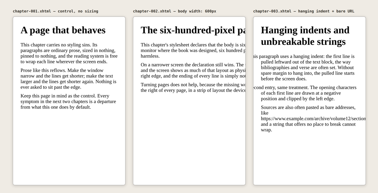
The numbers, probed from the live layout rather than eyeballed: the control chapter occupies 360 of 360 pixels with nothing hidden. The fixed-width chapter is laid out to 600 pixels — 264 pixels of every line exist and are never displayed. The hanging indents compute to -38.4px against a 24-pixel margin, so each first line starts 14 pixels before the screen does, and the bare address extends the chapter to 582 pixels, hiding 222.
| Chapter | Laid out to | Hidden on a 360 px screen |
|---|---|---|
| Control, no sizing | 360 px | 0 px |
body { width: 600px } | 600 px | 264 px of every line |
| Hanging indent, −38.4 px | starts at −14 px | first characters of each entry |
| Bare address, no break points | 582 px | 222 px of the address |
Three different declarations, one shared property: each states a geometry in absolute terms, and absolute terms are a bet about the screen. Kobo’s own publisher guidelines make the same point about images in reflowable books — dimensions should be set in percentages rather than fixed pixel values so content scales across screen sizes. Text blocks earn the identical advice, for the identical reason.
Replace the geometry, keep the words
Since the fault lives in the stylesheet, the repair is a new stylesheet, and that is what Style Studio does. We dropped cutbook.epub into the live studio and downloaded it untouched apart from the studio’s defaults:
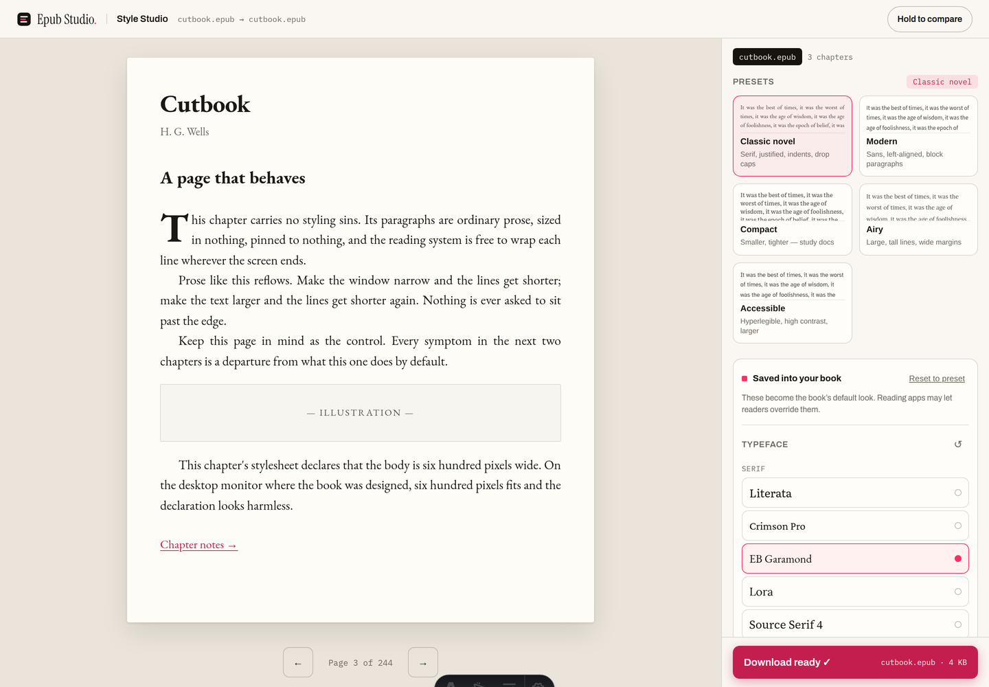
Inside the 4,500-byte output, every chapter’s link to css/book.css is gone, replaced by a link to a generated epub-studio.css (1,141 bytes) whose body rule sets max-width: 64ch — a width in characters that the engine may shrink, never a pixel count it must obey — and whose paragraph indents are all positive. The old book.css is still in the archive, orphaned; nothing links it any more, though a hand-tidier would delete it. Back in the same 360-pixel viewer:
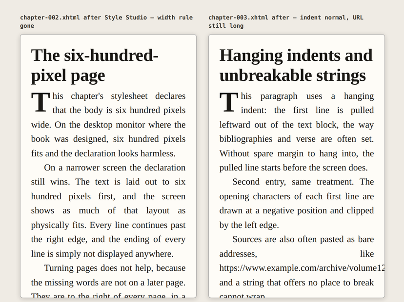
The probes agree with the picture. The formerly 600-pixel chapter now occupies 360 of 360 pixels; the first character of each hanging entry sits at +22 pixels instead of −14. Two of the three faults were stylesheet geometry, and they left with the stylesheet.
The overflow no restyle can cure
The third fault stayed, and honestly so. That bare address is a single string with no spaces and no break opportunities, and a line-breaking engine cannot wrap what offers no place to break. Restyling actually lengthened it — the studio’s default type is larger than the fixture’s, so the unbreakable string now extends 324 hidden pixels instead of 222. The fix for content is editing the content: shorten the address, or turn it into a linked phrase, the same open-edit-repack loop as any other hand edit in a Sigil-class editor.
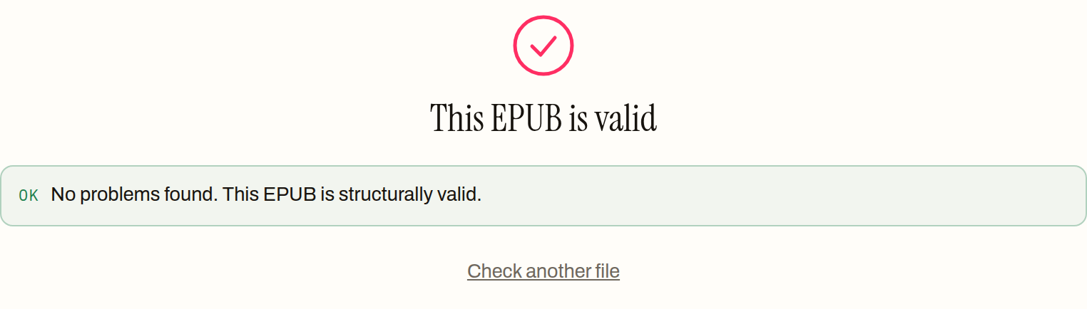
Two more limits worth naming. Style Studio strips stylesheet links and embedded style blocks from every chapter, but an inline style="width: 600px" written on an element inside the text survives a restyle — rarer, and it needs the hand-edit route. And none of this is something a checker will warn you about in advance: we ran the clipping fixture through the live validator and it passed clean, because a fixed width is legal CSS in a structurally valid book.
We have also not tested any particular device here — no claims about how a specific Kobo, Kindle or phone app crops its pages, because none of them can be driven in this environment. What the harness shows is the layout engine’s side of the story: geometry requested, screen supplied, difference clipped.
So when the ends of lines go missing, stop adjusting the font menu — the declaration outranks it. Open the book in Style Studio, give it a geometry stated in characters instead of pixels, and let every line end where your screen does.
How to fix an EPUB whose text is cut off
- 01 Open the clipped book in Style StudioLoad the EPUB in the browser-based studio. The preview lays the book out to your settings, not to the geometry the old stylesheet demanded, so the missing text is already back.
- 02 Pick a preset and downloadAny preset will do — the download replaces every chapter's link to the old stylesheet with a generated one that sets no fixed widths and no negative indents.
- 03 Re-check the page that clippedIf a line still runs off the edge, what is overflowing is an unbreakable string in the text itself — a bare web address, usually — and that needs an edit, not a restyle.
Frequently asked questions
Why is my EPUB text cut off on the right side of the screen?
The most common cause is a stylesheet that sets the page or a text block to a fixed pixel width. The reading system lays the text out to that declared width first and your screen shows the part that fits, so on any display narrower than the declaration, every line continues past the right edge. On our test file a 600-pixel body on a 360-pixel screen hid 264 pixels of every single line.
Why are the first letters of some paragraphs missing instead?
That is the same fault mirrored to the left edge. A hanging indent pulls the first line of a paragraph leftward with a negative text-indent, and when the book does not reserve enough margin to hang into, the opening characters are drawn at a negative position — before the screen starts. Bibliographies, verse and reference lists are the usual carriers.
Why does turning the font size down not bring the missing words back?
Because the declared width is in pixels, not in characters. Shrinking the type squeezes more words onto each 600-pixel line, but the line is still laid out to 600 pixels and the screen still shows 360 of them. The ending of every line stays exactly as invisible as before, which is a strong sign the fault is a fixed width rather than anything you control from the reader menu.
Will an EPUB validator catch a book that clips text?
No. Validation checks structure — the container, the manifest, the spine — and a fixed width is perfectly legal CSS in a perfectly valid book. Our clipping fixture passed a validator with no problems found while hiding almost half of every line on a phone-sized screen. Valid and readable are different tests.
Why does the book read fine on my computer but clip on my phone?
A fixed width only misbehaves on screens narrower than the number it asks for. A body set to 600 pixels fits comfortably inside a desktop window, so the person who made the book saw nothing wrong; a phone in portrait has fewer pixels than the declaration and crops the difference. The book is the same everywhere — the screens are not.
Can I fix the stylesheet by hand instead of restyling the whole book?
Yes, if the book is yours to edit. Unzip the EPUB, find the width declaration or the negative text-indent in the CSS, delete it, and repack the archive correctly. That is the surgical route; replacing the stylesheet wholesale is the fast one. Both end the clipping, because both remove the geometry the screen could not honour.